Little Italy Wayfinding Signage
Wayfinding System Design & Environmental Graphics | December 2025
Role: Lead Designer | Project Manager
Firm: Graham Projects
Partners: Little Italy Neighborhood Association
Firm: Graham Projects
Partners: Little Italy Neighborhood Association
Location: 221 S High St, Baltimore, MD 21202
Project Summary
Designed wayfinding signage and sidewalk markers for the Little Italy Neighborhood of Baltimore to increase recognition and travel to the area. Working alongside the neighborhood association for almost two years, we went through many design iterations to ensure the wayfinding aligned with the community's identity. Designing this system not only included the graphical elements, but the specific placement and directionality of the 26 signs and 38 sidewalk markers. Drawing a balance between the client's desires and our professional expertise and recommendations, we formulated a layout system that the client, community members, and business owners agreed upon to help create a sense of place and public draw to the area, especially from people who are visiting Baltimore for the first time.
The Designs
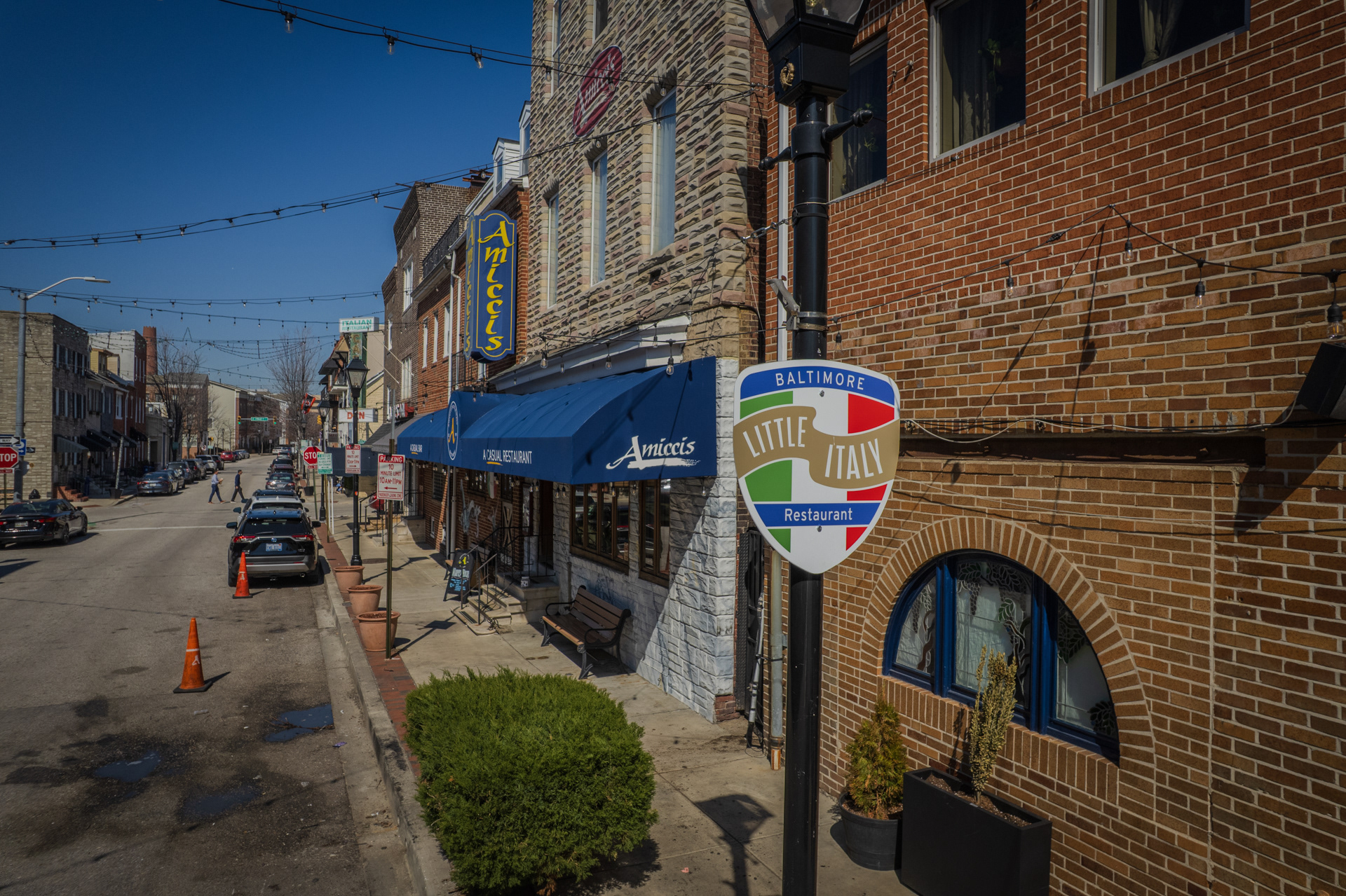
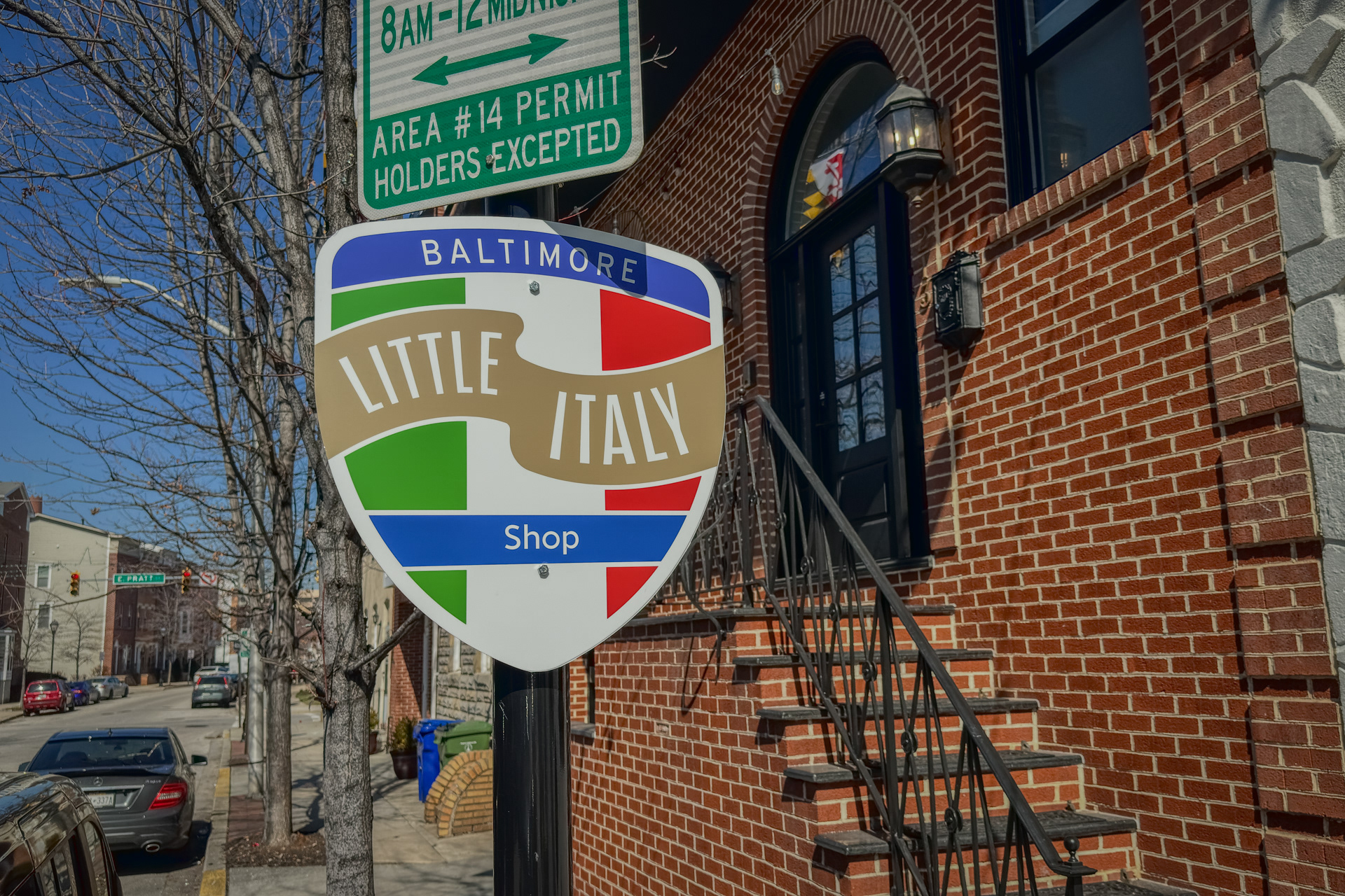
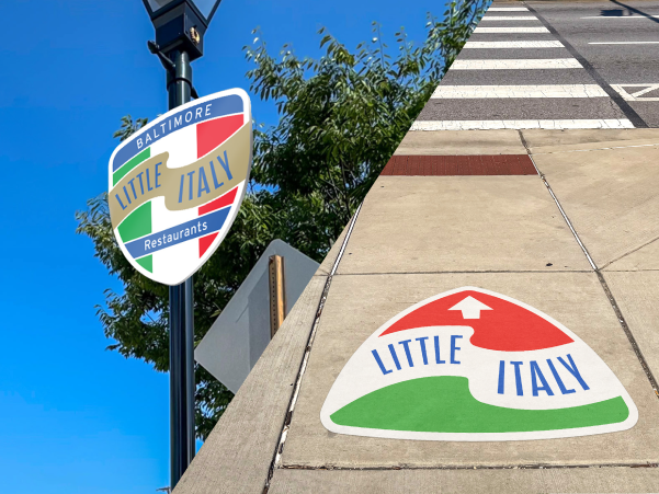
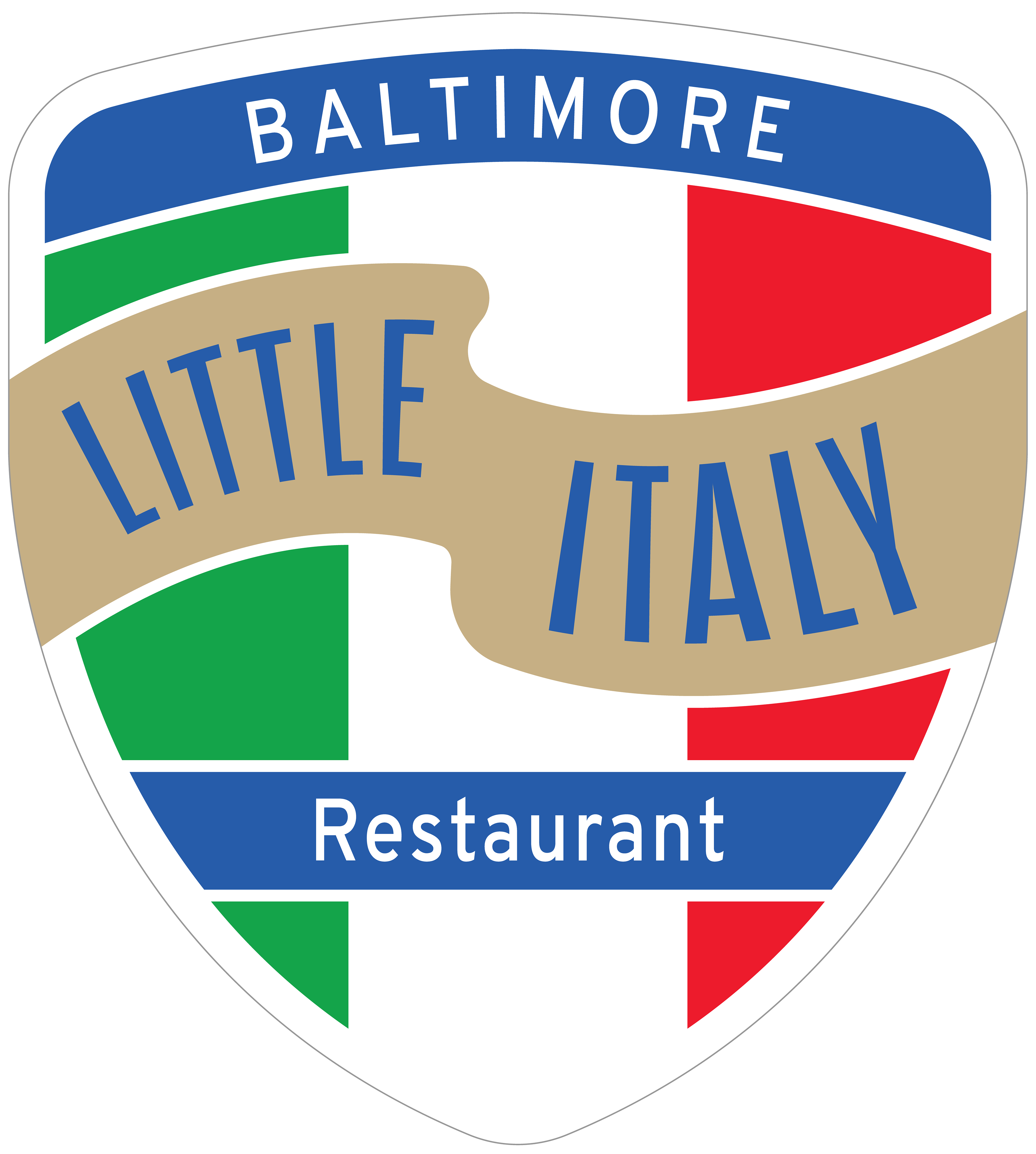
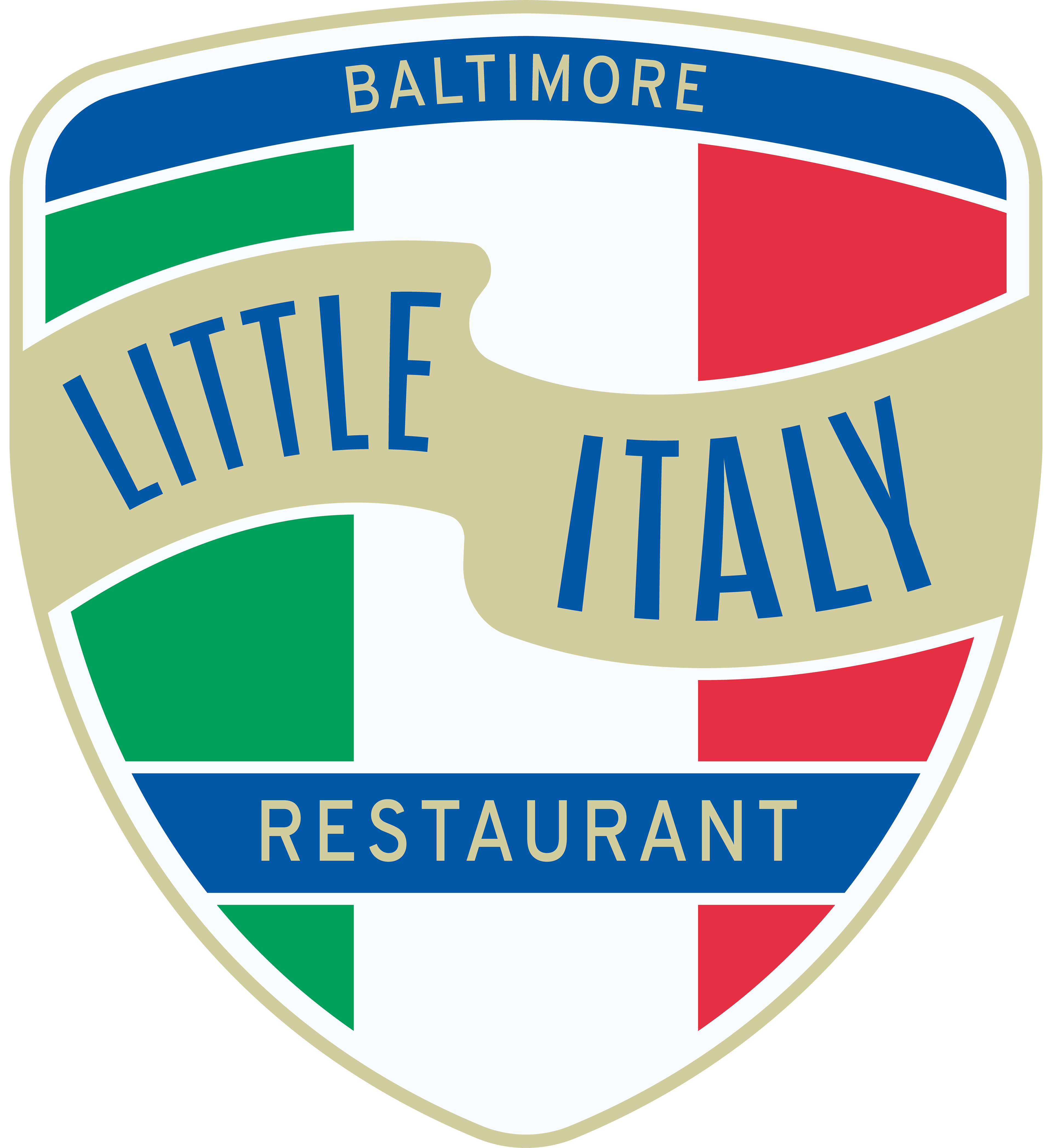
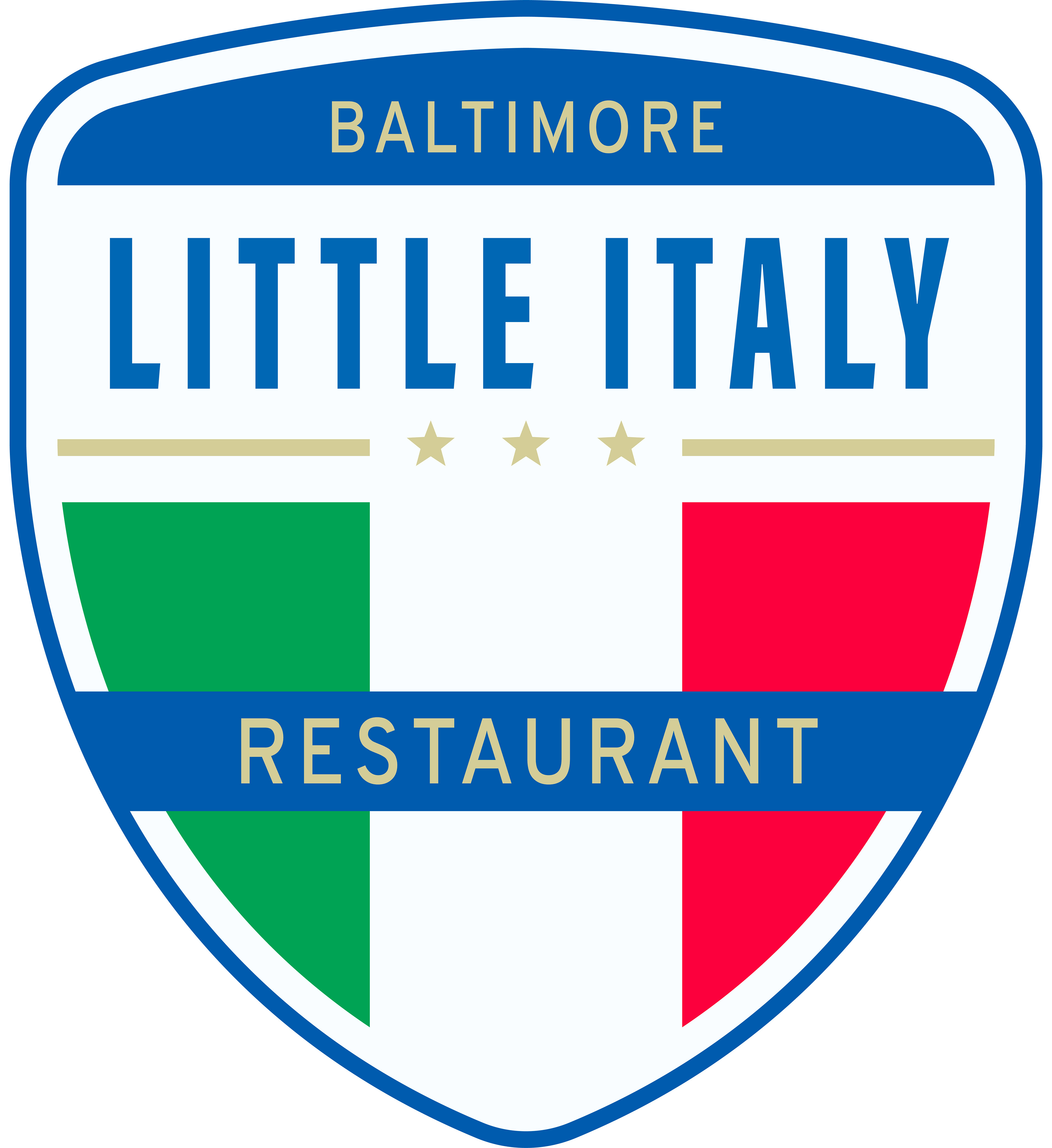
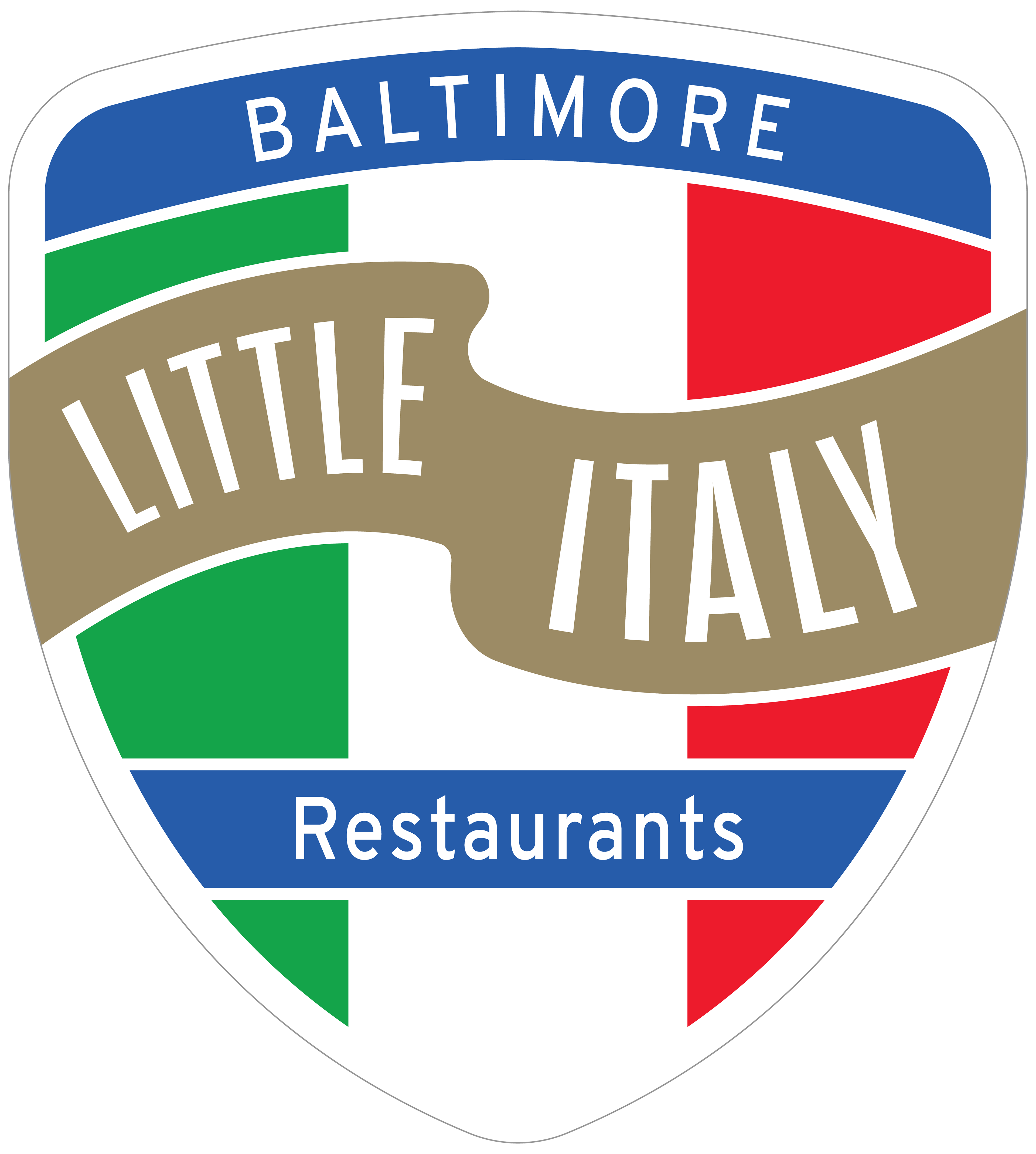
Sign
The sign's look stems from the clients desire to go for a look that is "classic Italian" and draws from Italian flag for it's main color scheme. The use of blue is prominent in Italian shops, local graphics, and especially in their sports so it felt natural to use blue as an accent color.
A waving ribbon is used to capture a classic feel and give the two-dimensional sign a sense of depth and really draw you eye to the "Little Italy" text without feeling too modern and minimalist.
"Baltimore" was included at the top so when people see the sign, whether in online or in person, they know they have arrived at Baltimore's official Little Italy neighborhood or seeing a video and knowing exactly where it is.
The blue plate on the bottom third was used to create a spot for location designations. There are currently four types of sign designations in the neighborhood, but the goal is that they can be easily swapped out without the need for the whole sign being replaced and having to go through the city and permitting.
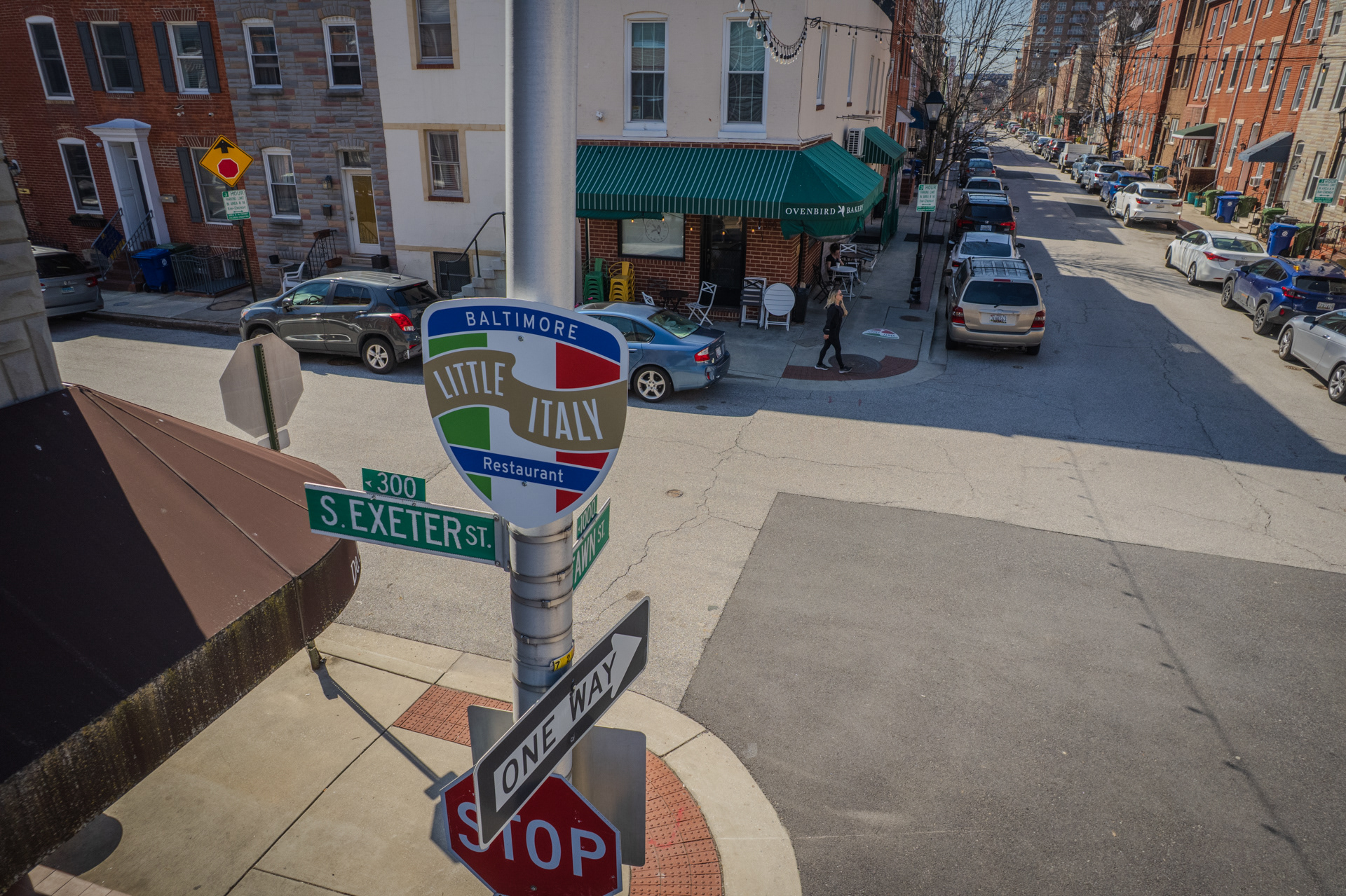
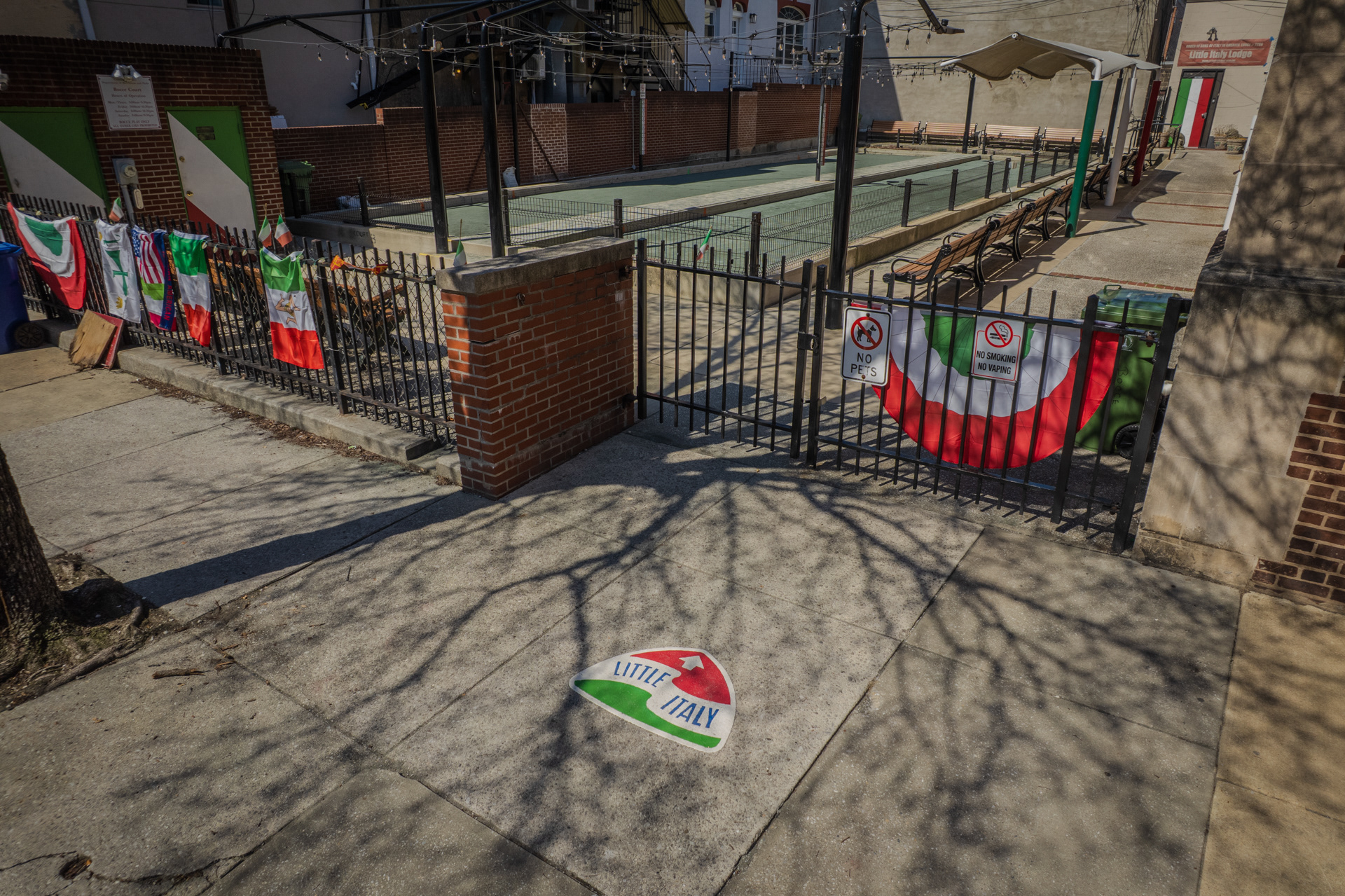
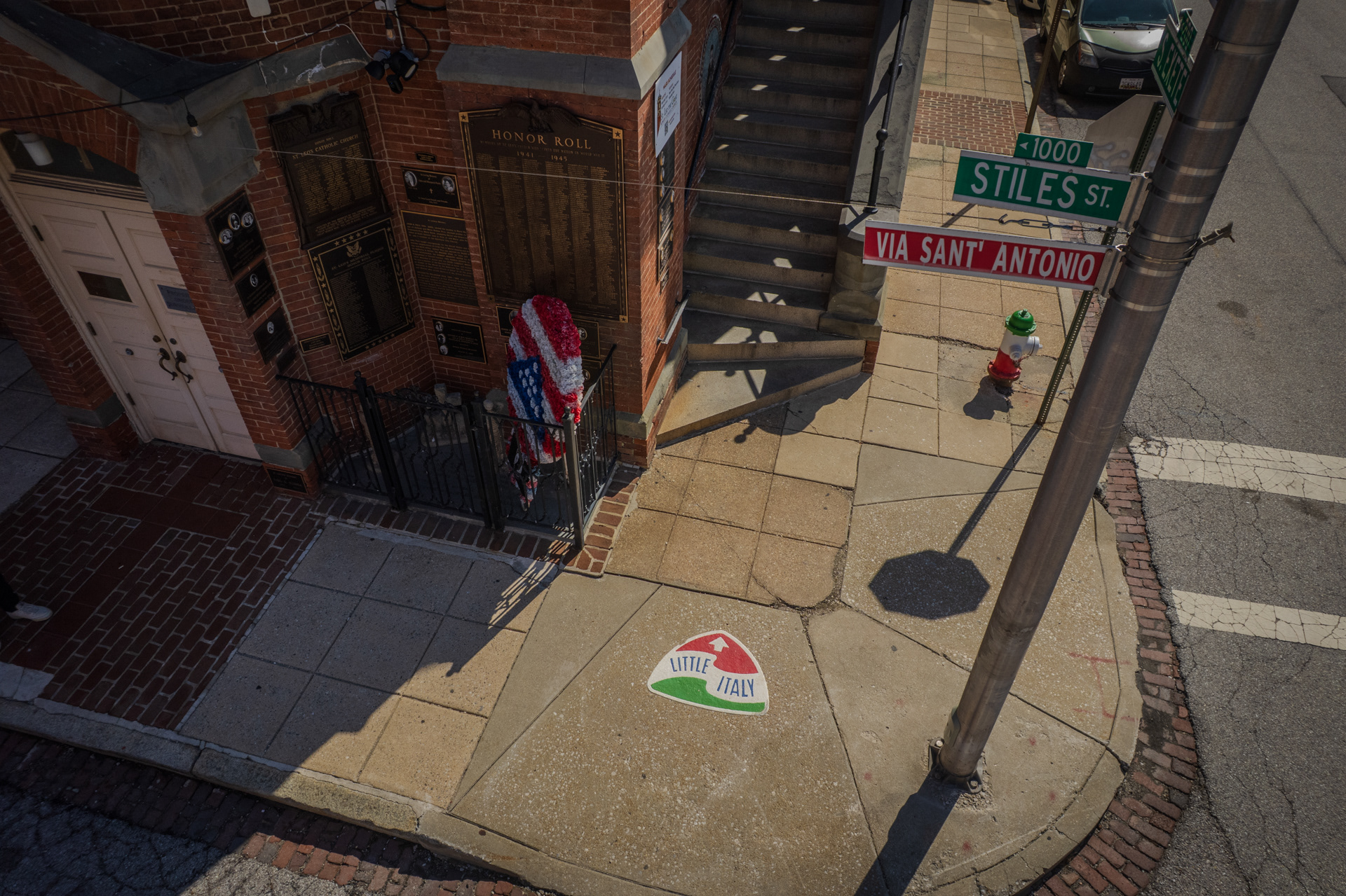
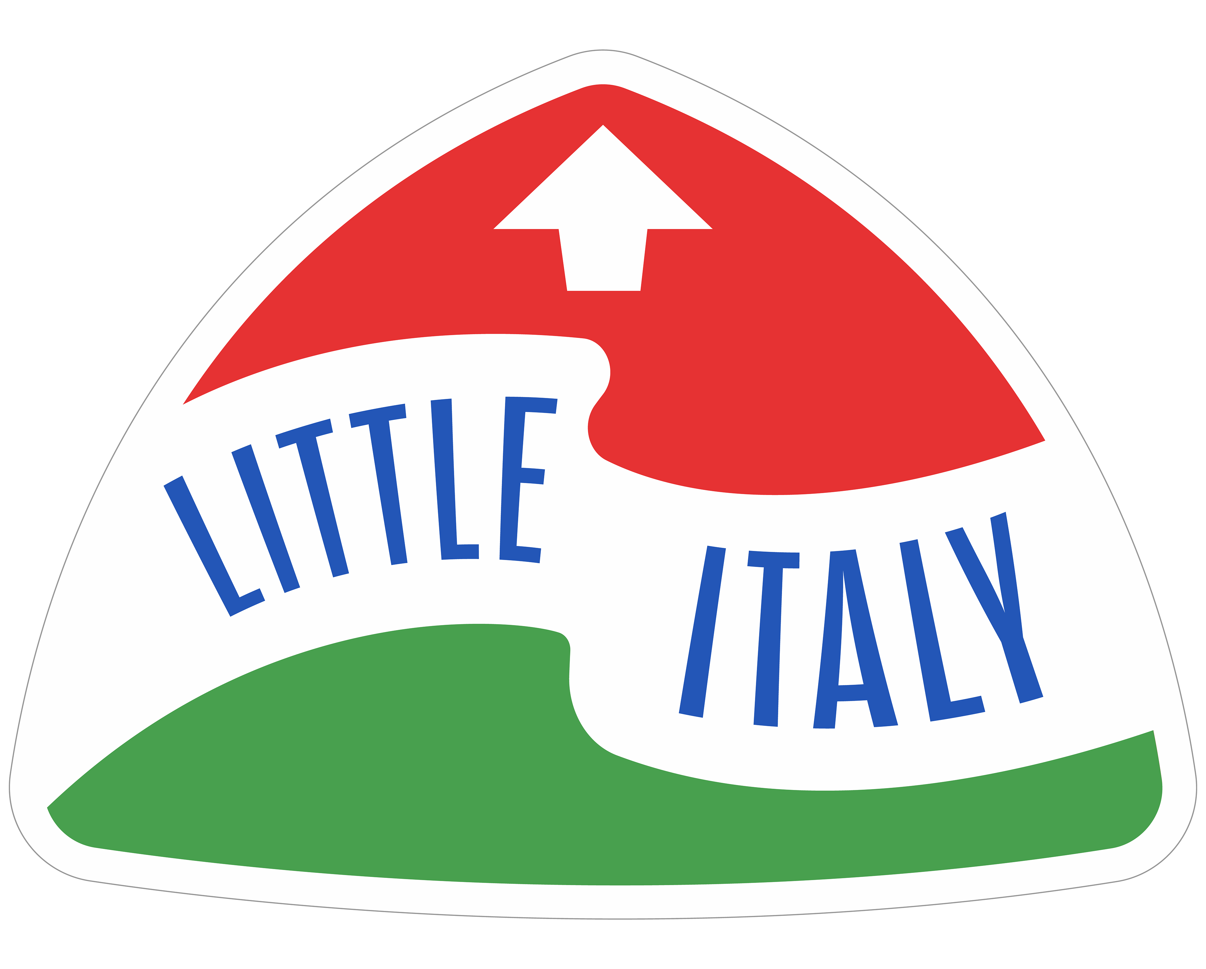
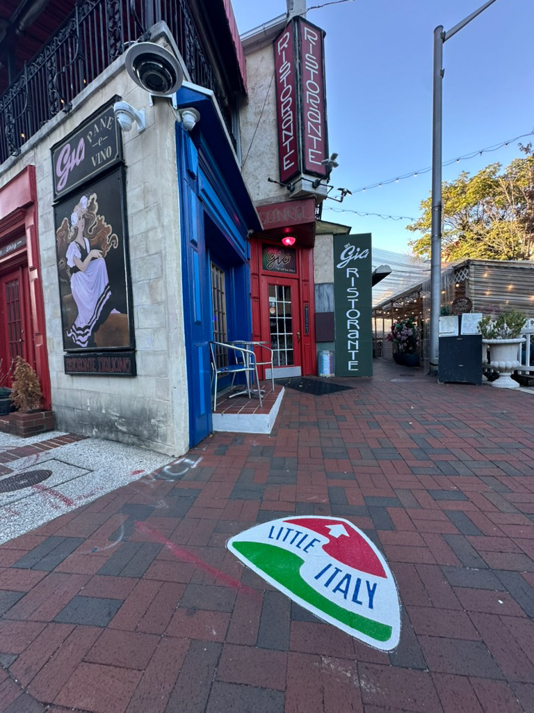
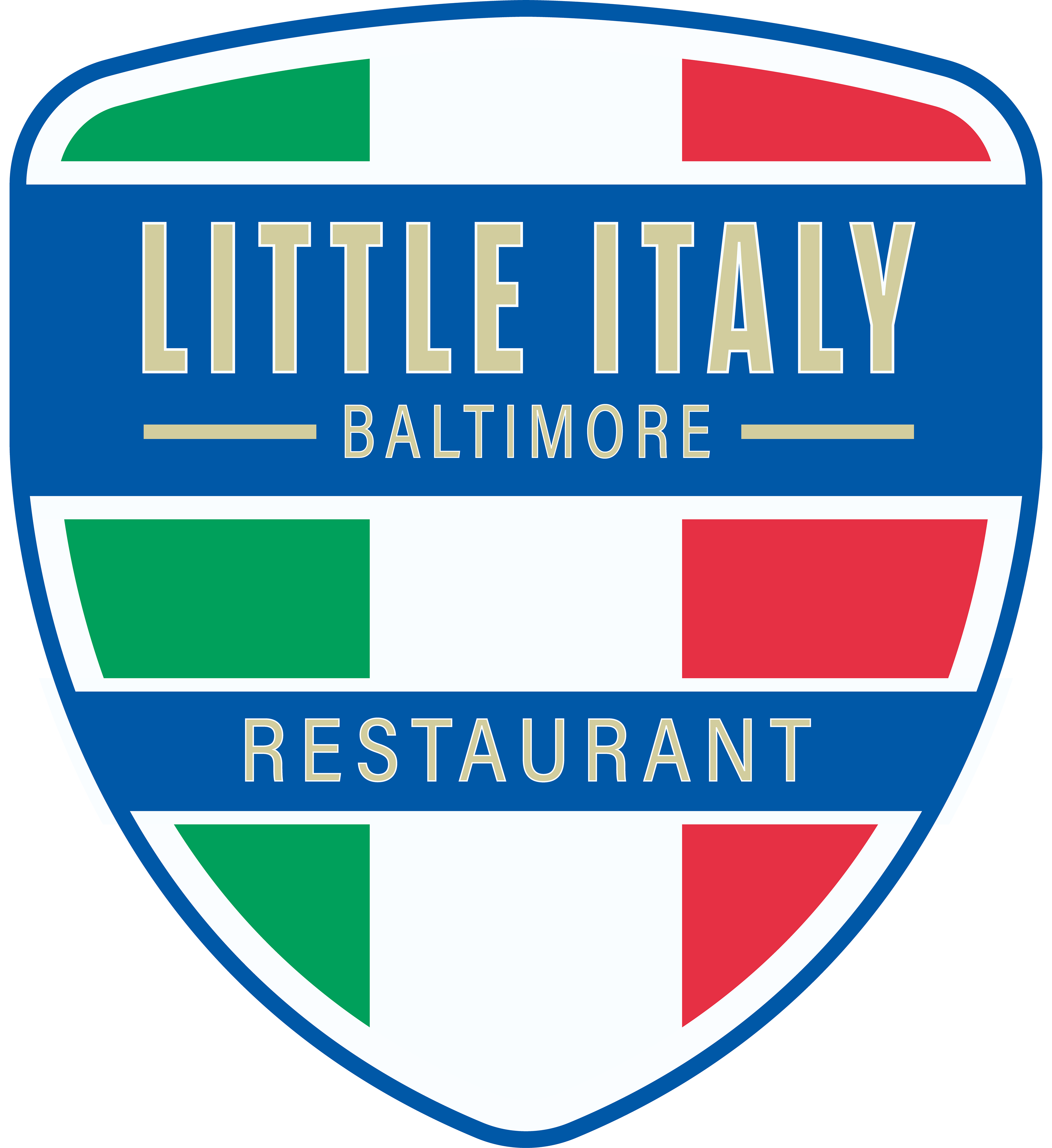
Sidewalk Marker
This design was born from the sign, and created to mirror the theme and feel so that the wayfinding network can feel unified. Similar to the waving ribbon from the sign, the banner utilizes the ribbon to still create a classic feel and give people a sense of movement. Symbolically, the ribbon and it's choice to be white rather than gold, lets it represent the white in the Italian flag, since it is sandwiched between red and green.
An arrow is present on these markers as a direct form of wayfinding and pointing people in the direction of the core of Little Italy. Not only does the arrow do this, but the whole shape of the marker itself. To achieve this shape, I adapted the bottom of the shield shape used for sign, helping achieve unified forms across the system.
Iterations
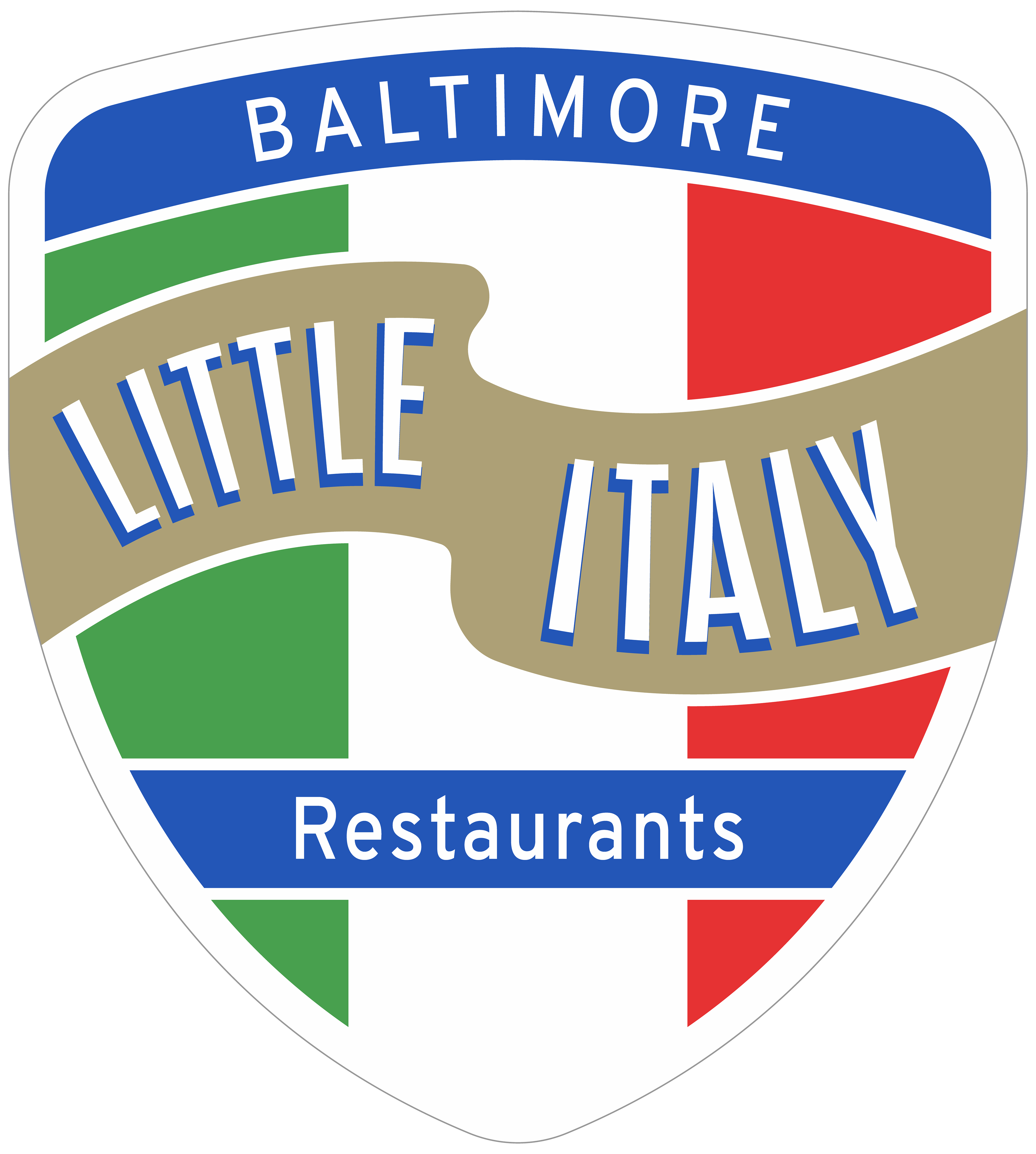
Early Concepts


Concepts Based Off Initial Feedback
Client and community overwhelmingly voted to move forward with rounded shield design direction.
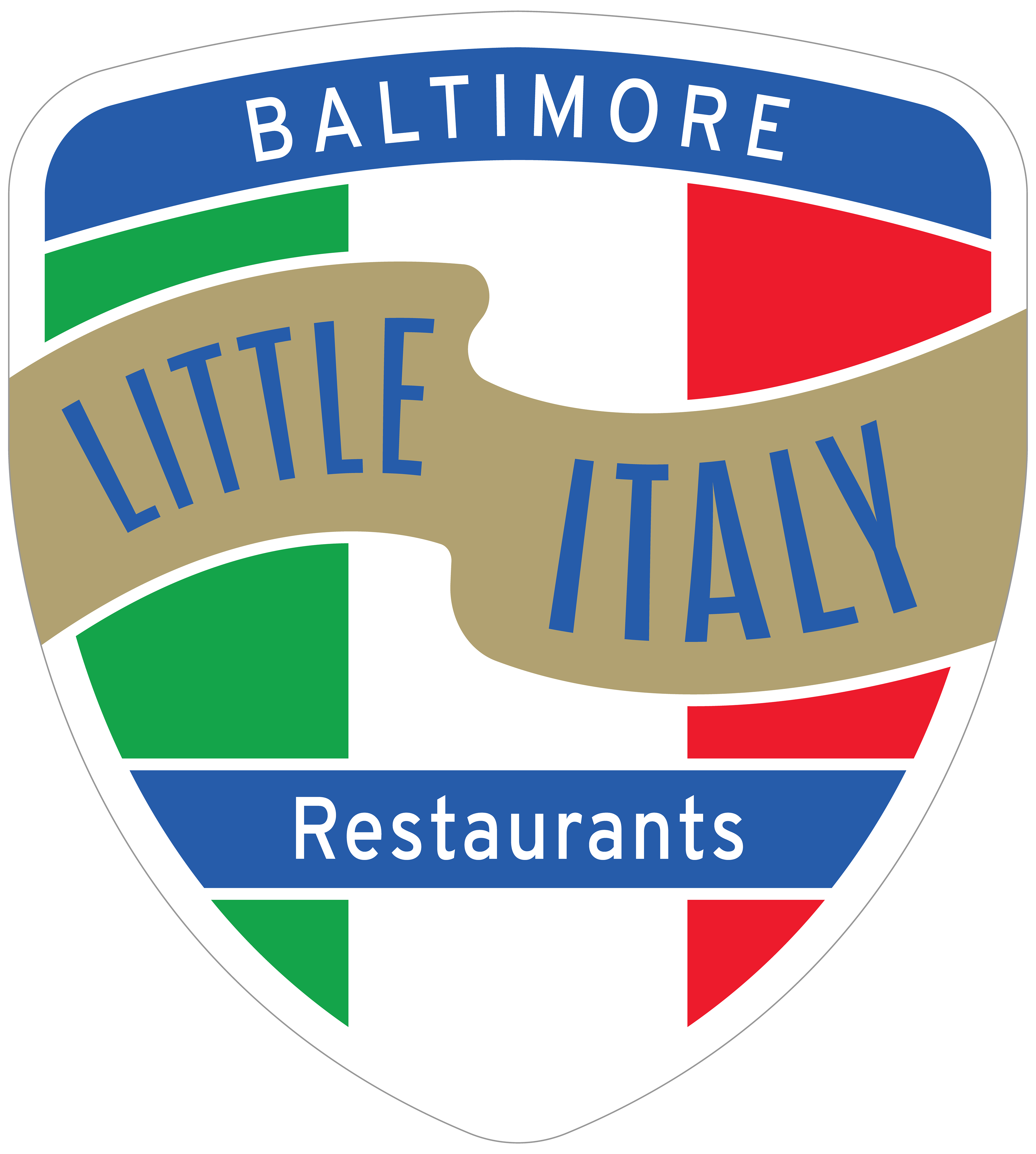
Revised Concepts
After this review with the client, the support was to move forward with detailed revisions of the first concept listed above. From here, we refined colors, legibility, did site visits to test for ideal text sizing and contrast needs, and started to concept the wayfinding network.
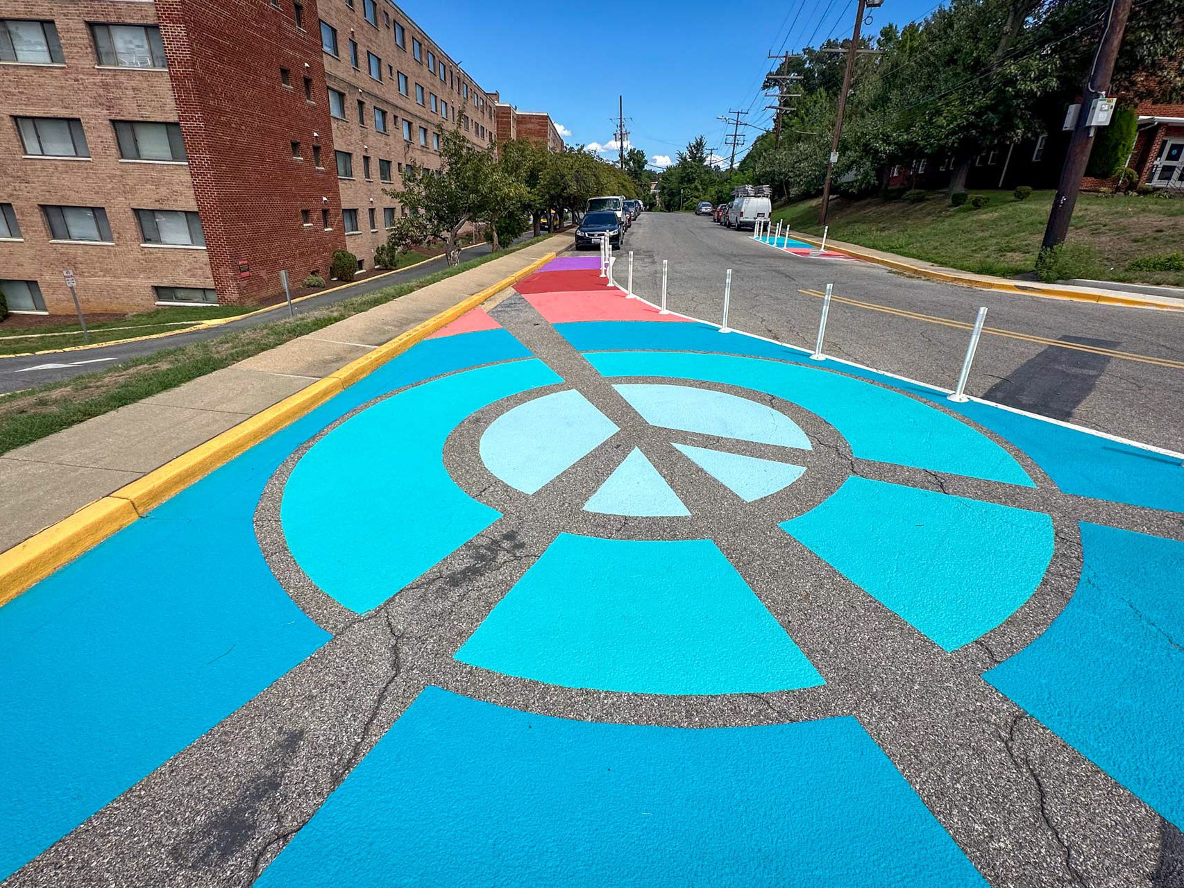
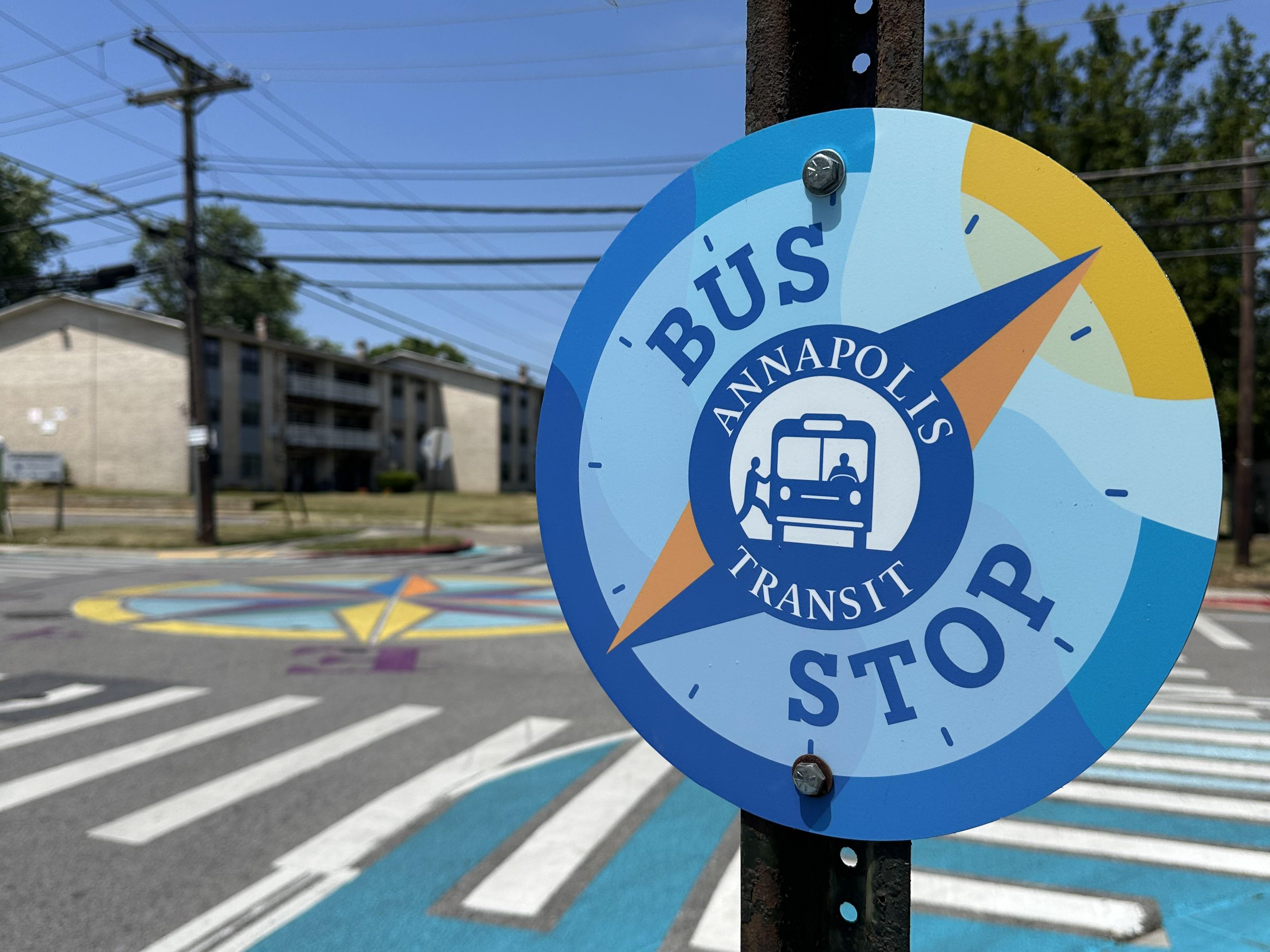
More Photos